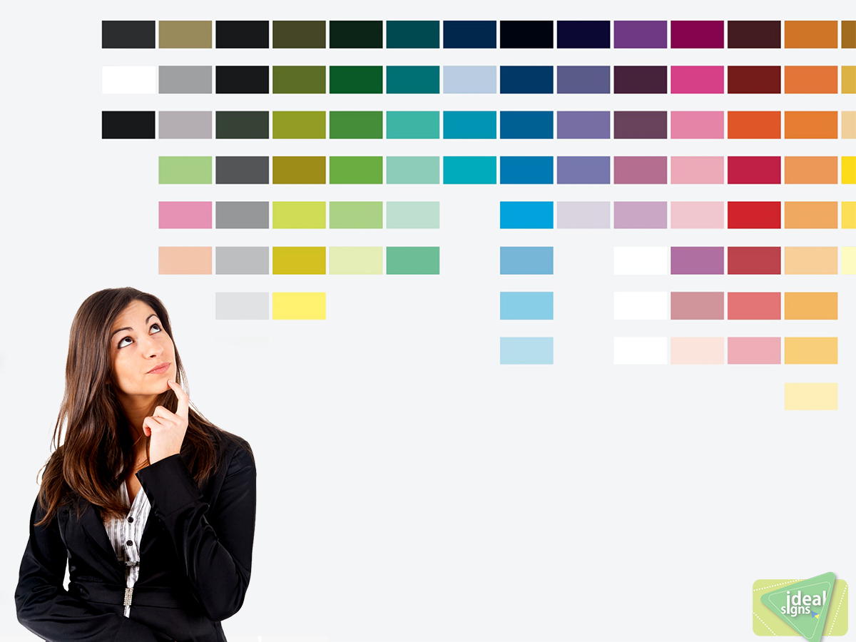
Ideal Signs always collaborate with its clients to show them the colors that will make the business identity visible or will be remembered. Sometimes you already know how influential colors can be.
Ideal Signs always collaborate with its clients to show them the colors that will make the business identity visible or will be remembered. Sometimes you already know how influential colors can be. Colors set the mood everywhere and in everything, and different hues trend each year. You probably kept these things in mind when you decided on your business’s logo and interior décor. The concept is no different when it comes to the signs you display inside and outside your business. Signage is a vital promotional tool, so make sure you know how to pick the best colors for advertising signs to create the greatest effect on customers.
Theory of Color’s
The primary colors are those that don’t come from any colors but are the source of all other ones. They are red, yellow, and blue. Secondary colors are those that come from mixing primary colors. Red and yellow make orange, yellow and blue make green, and blue and red make purple.
Tertiary colors are created by combining primary and secondary colors, such as blue and purple to make blue-violet. Mixing colors in real life is more complex, whether with paint or printer ink, but having a basic idea of the relation between colors is helpful in knowing how to pair them.
Colors that go together are complementary. They are opposite each other on the color wheel, such as blue and orange. Analogous colors are three adjacent hues, which means they are similar to each other.
Saturation, or chroma, refers to the intensity and purity of color based on light. Reducing the saturation of color lightens it, whereas increasing the saturation darkens it. On a related note, tinting is adding white to a color to make it lighter, and shading is adding black to make it darker. These are only some of the ways to alter the appearance of a color.
Catching Customers’ Gaze
What colors you choose for signs will determine how effective they are at grabbing customers’ attention. For example, neutral colors easily blend in with the environment. Neutrals are white, black, and various tones of brown and gray. Sometimes dark colors can act as neutrals, such as navy blue.
The best colors for outdoor banners and the like are bright hues because they stand out. A radiant yellow, fiery red, or neon green is more noticeable than a neutral. However, this doesn’t mean that you should only use bright colors and ignore neutrals. The idea is to strike a balance to create the perfect contrast.
How Contrast Makes a Difference
Have you ever noticed how a color can look different based on what other colors surround it? For example, putting the same shade of purple side by side on different backgrounds would change how you read each one. On a bluer background, the red tones would come out, so it would appear more of a red-violet. On a redder background, the blue tones would come out, so it would appear more of a blue-violet.
Likewise, what neutral is in the background determines the perception of contrast and size? A small red square inside a large black one would pop and look bigger. On a white background, it would look duller and smaller. On top of an analogous color, such as orange, the red square would get lost. With its complementary color, green, it would stand out more.
The Best Color Contrast for Signs
Now that you have a better understanding of how colors work together, you can see why the selection is important when it comes to signage. The biggest thing to consider in this situation is the text. You have to make sure that the combination you choose makes the words easy to read, especially for people who are driving by or are at a distance. The highest legibility comes with a brightness difference of 70 percent or more, which means that in most cases, the pairing will be a dark hue and a light hue. The following are some of the most visible color combinations for signs:
- • Black background with white or yellow lettering
- • White background with black, dark blue, gray, or red lettering
- • Red background with yellow or white lettering
- • Yellow background with black, dark blue, or red lettering
- • Dark blue background with white or yellow lettering
- • Light blue background with black or red lettering
The success of your business relies in part on the effectiveness of your signs. Take the time to consider which colors to use to maximize the sign’s visibility, legibility, and power.

